

joan’s
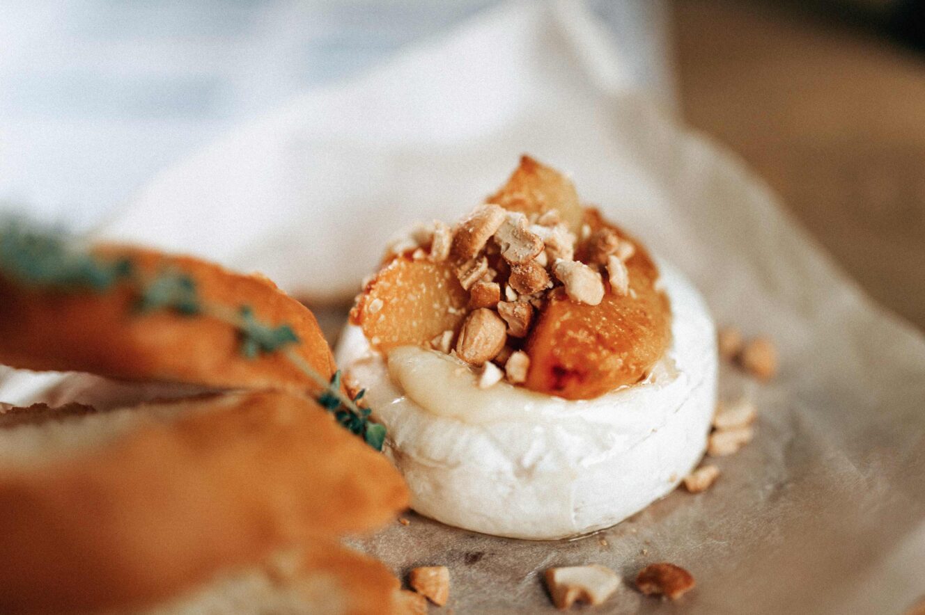
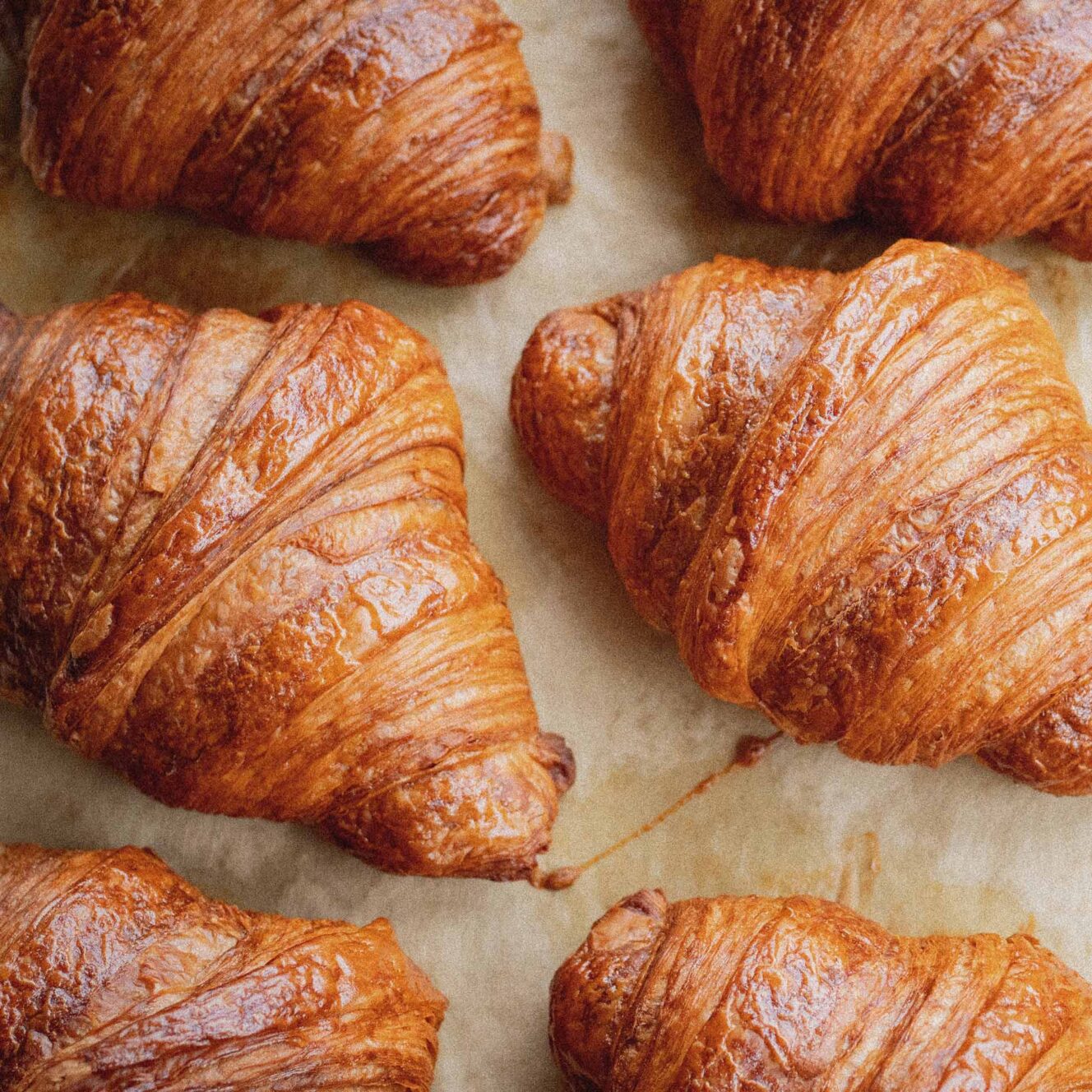
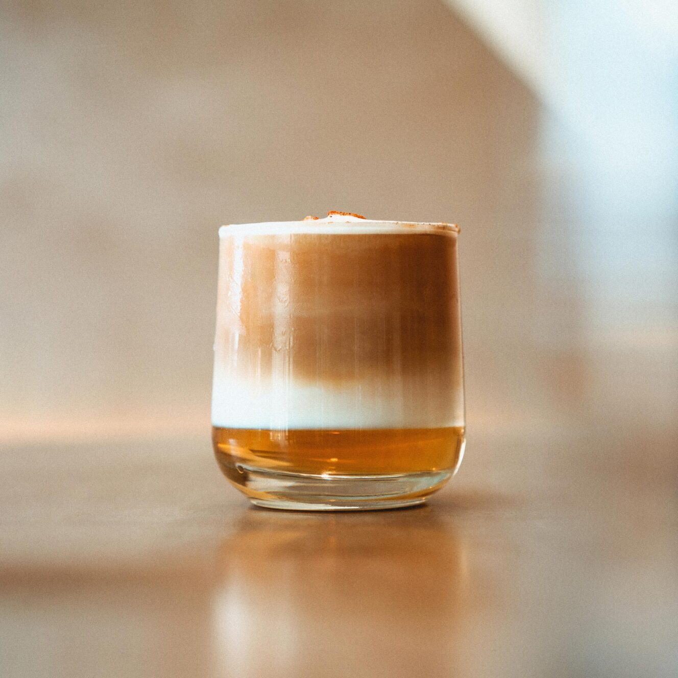
A late rise on a lazy Sunday and a slow stroll down the road finds you at Joan’s; your humble local café on the corner. Warm, flaky and buttery, the scent of perfect pastries ushers you in the door—accompanied by the rich aromas of your favourite specialty coffee.With a distinctly French menu, Joan’s proudly serves up an array of artisanal cheeses, charcuterie, and fresh, crusty baguettes. A tiny piece of Paris, everything is ‘just so’ atJoan’s.
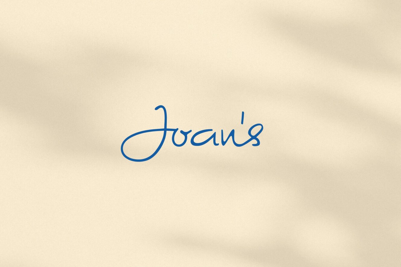
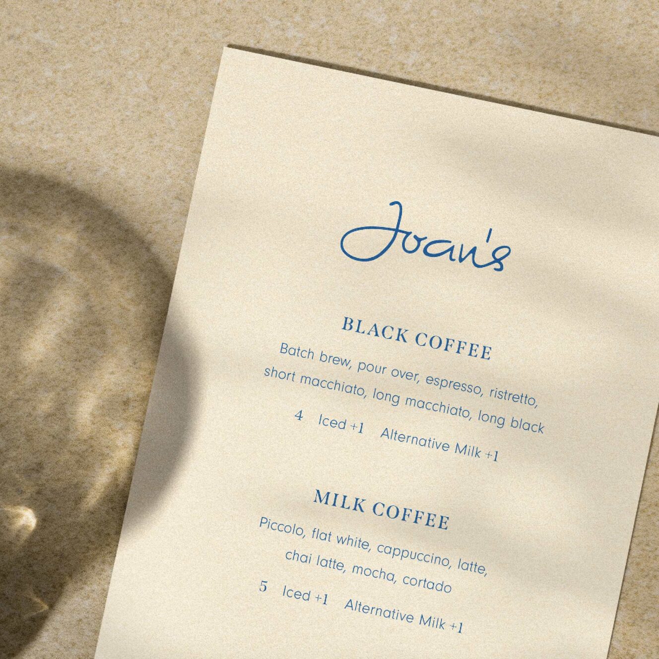
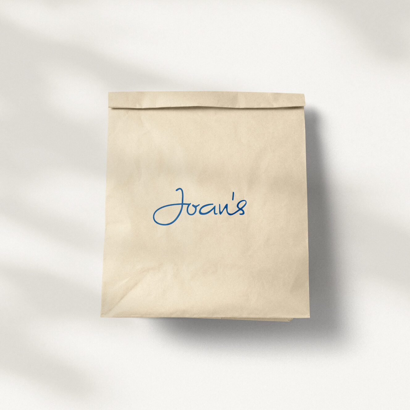
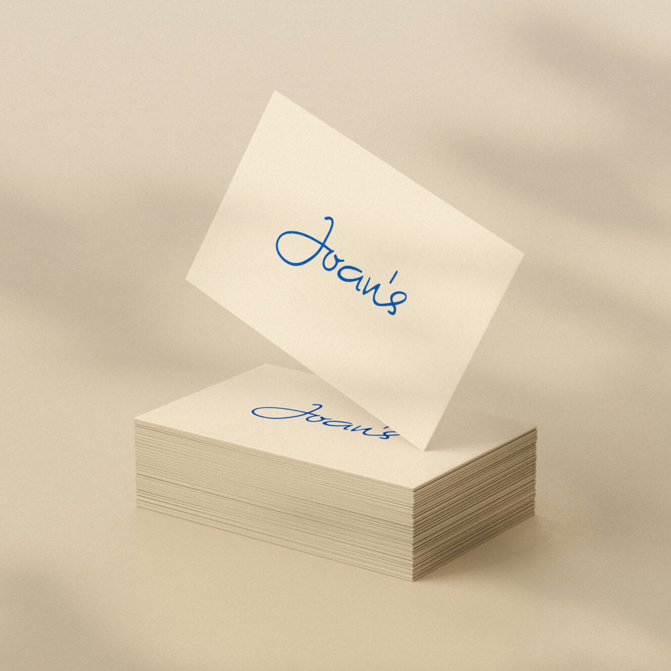
Like all classically good things in life, Joan’s brand has a natural character without pretension. Every element of the brand is imbued with effortless confidence and a sense of timelessness. We captured Joan’s unique personality, embedding it into the café’s packaging and print collateral—its simple yet sophisticated menus, takeaway cups and more. The hand-lettered signature is core to the café’s brand identity, embodying warmth, elegance and homely charm. We chose an inherently Parisian colour palette of warm whites, creams and a signature blue. Quaint and charming by design, Joan’s brand reflects everything you want in a neighbourhood café
